Common Painting Mistakes in Commercial Spaces and How to Avoid Them
Understanding the Impact of Color
When painting commercial spaces, choosing the right color is crucial. The color palette influences not only the aesthetics but also the mood and functionality of the space. A common mistake is selecting colors based solely on current trends without considering the business's brand identity or the psychological effects on customers and employees.
To avoid this, it's essential to align the color scheme with the brand's message. For instance, blues and greens can create a calming environment, while reds and oranges may boost energy and creativity. Always consider the space's purpose and the atmosphere you want to create.

Ignoring Surface Preparation
Skipping or rushing through surface preparation is a frequent mistake in commercial painting. Proper preparation ensures a smooth and durable finish. Failing to clean, sand, or prime surfaces can lead to peeling paint and uneven textures.
To prevent these issues, always start with a thorough cleaning to remove dust and grease. Sanding the surface helps to even out imperfections, while priming provides a solid base for the paint to adhere to. Investing time in preparation pays off in quality and longevity.
Inadequate Lighting Considerations
Lighting significantly affects how paint colors appear in a space. Overlooking this aspect can result in unexpected and often undesirable outcomes. Colors may look different under natural versus artificial lighting or in areas with varying light exposure.
To avoid surprises, test paint samples on the walls and observe them at different times of the day. This practice helps in selecting a color that consistently looks appealing in various lighting conditions.

Choosing the Wrong Paint Finish
Selecting the appropriate paint finish is as important as picking the right color. Different areas in a commercial space have specific needs, and the wrong finish can lead to maintenance challenges and aesthetic issues.
For high-traffic areas, a semi-gloss or satin finish is ideal due to its durability and ease of cleaning. In contrast, a matte finish may be suitable for areas where a softer look is desired. Always consider the function of the space when choosing a finish.
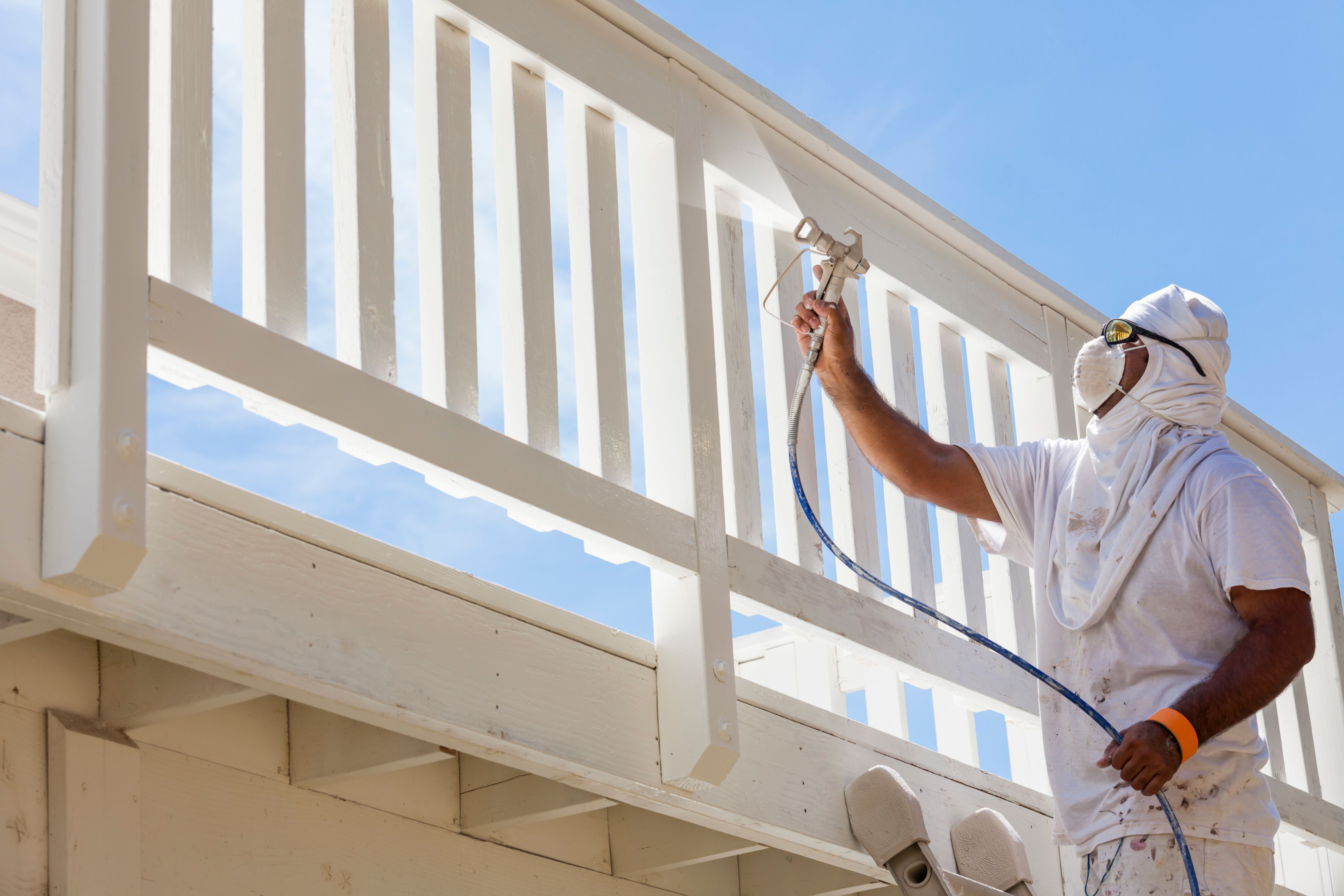
Overlooking Safety Protocols
Safety is paramount when painting commercial spaces. Neglecting safety protocols can endanger workers and disrupt business operations. Common oversights include inadequate ventilation and improper handling of hazardous materials.
To ensure safety, always use protective gear, ensure proper ventilation, and follow guidelines for handling and disposing of paint materials. A safe work environment not only protects workers but also minimizes downtime for the business.
Conclusion
Avoiding common painting mistakes in commercial spaces requires careful planning and attention to detail. By understanding the impact of color, preparing surfaces adequately, considering lighting, choosing the right finish, and prioritizing safety, businesses can achieve a professional and lasting result. Investing in these practices not only enhances the space's appearance but also supports the business's overall success.